How to use grid area to create grid layout
grid area is an important part of the grid. It helps us to create layouts easily while writing less code. Grid is used to create a 2d layout with the help of HTML and CSS. if your layout is 1D dimension or you don’t need to manage columns and rows in your design you can use flex there.
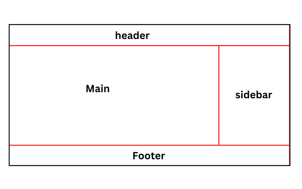
Source code
<!DOCTYPE html>
<html lang="en">
<head>
    <meta charset="UTF-8">
    <meta name="viewport" content="width=device-width, initial-scale=1.0">
    <title>Document</title>
    <style>
        *{
            margin: 0;
            padding: 0;
            box-sizing: border-box;
        }
        .container{
            display: grid;
            grid:
            'header header header header'
            'main main main aside'
            'footer footer footer footer';
            height: 100vh;

        }
        .container>*{
            border: 2px solid red;
            min-height: 100px;
        }
        header{
            grid-area: header;
        }
        main{
            grid-area: main;
            height: 70vh;
        }
        aside{
            grid-area: aside;
        }
        footer{
            grid-area: footer;
        }
    </style>
</head>
<body>
    <div class="container">
        <header></header>
        <main></main>
        <aside></aside>
        <footer></footer>
    </div>
</body>
</html>Loading...
About Author
Loading...
what's inside
Whatsapp Group
 Frontend developer
 whatsapp group